You may also like
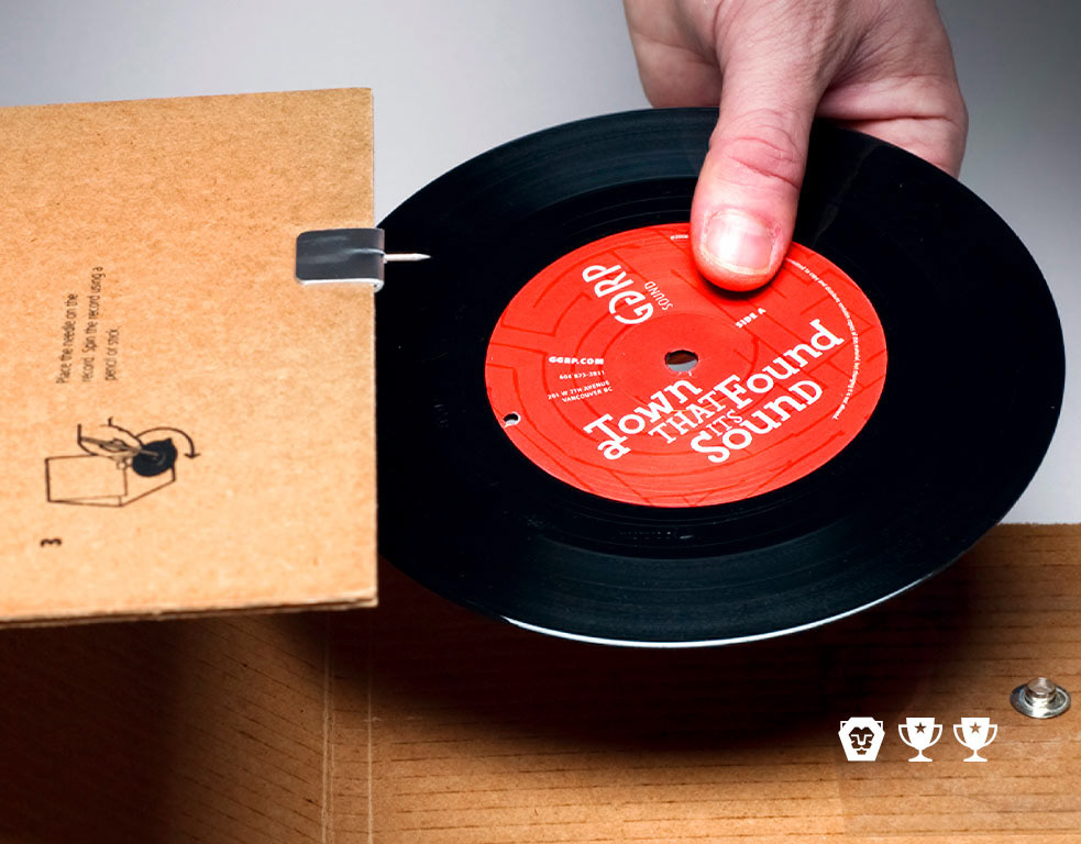
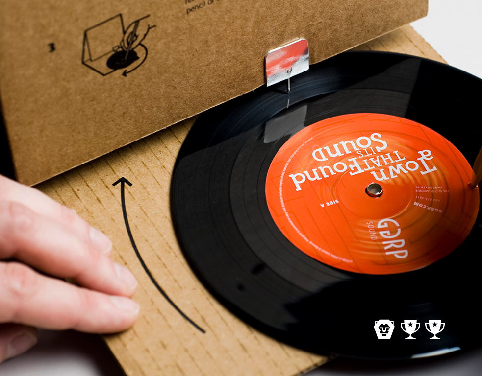
GGRP
2013
Grace Notes
2020
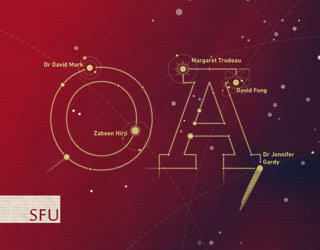
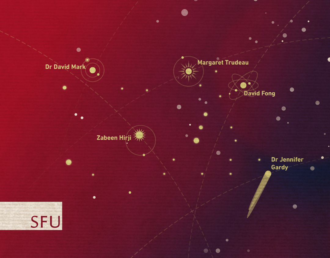
SFU Outstanding Alumni Awards
2016
Quarry
2018
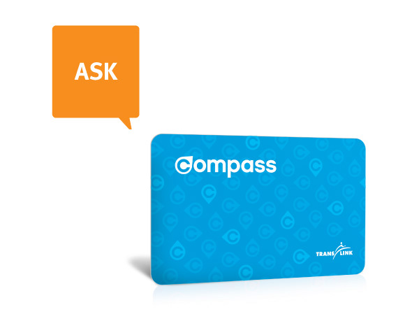
Ask Compass
2014
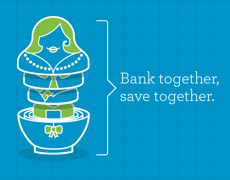
The Unlimited Family Plan
2014
Say she ate it
2024
↑
Back to Top